Olga, 22
Student · Solvency: low
- Motivation
- Cook quick, tasty, and budget-friendly meals to save time and money.
- Expectations
- Simple recipes with minimal ingredients, filters for price and cooking time.
Case study · Dishcover
Dishcover is an iOS and Android app with easy, step-by-step recipes for every taste, designed end to end: research, user flow and more than 100 screens in light and dark, in three and a half months.
Many people struggle with cooking — whether they feel uninspired, lack experience, or simply don't enjoy spending time in the kitchen. When hunger strikes, they often feel stuck with the same repetitive meals or don't know what to cook with the ingredients they have. This leads to frustration, wasted food, or the temptation to order takeout again.
Dishcover helps by offering easy, step-by-step recipes that match the ingredients in your kitchen. Whether you're a beginner or just need a quick idea, the app turns everyday cooking into a simple and fun process — no planning, no stress, just tasty results.
The design process included multiple overlapping stages that were often developed in parallel rather than following a strict linear path.
01
02
03
04
I looked at the problem from four sides before drawing a screen: personas for who cooks and what they need, jobs to be done for what the app is hired for, a comparison with Mealime, Tasty and Kitchen Stories, and a customer journey map from the first launch to rating a dish. Its pain points are what the screens below are built on.
4
personas
from the user research
3
competitors compared
Mealime, Tasty and Kitchen Stories
7
journey stages
from the first launch to rating the dish
Student · Solvency: low

Young parent · Solvency: medium

Freelancer · Solvency: high

Food blogger · Solvency: high
| Project | A cooking service |
|---|---|
| Problem the app solves | Hunger |
| When the app is needed |
|
| Direct competitors | Tasty, Kitchen Stories: Easy Recipes |
| Indirect competitors |
|
| Substitutes | Food delivery apps |
| Section | Dishcover | Mealime | Tasty | Kitchen Stories |
|---|---|---|---|---|
| Onboarding |
|
|
— |
|
| Sign up / Log in |
|
|
|
|
| Personalization |
|
|
|
|
| Subscription |
|
|
|
— |
| Payment |
|
|
— | — |
| Home |
|
— | — | — |
| Recipe catalog |
|
— |
|
|
| Recipe page |
|
|
|
|
| Cooking steps |
|
— |
|
|
| Chef page |
|
— | — | — |
| Own recipes |
|
|
— | — |
| Favorites |
|
|
— |
|
| Meal planner | — |
|
|
— |
| Calendar |
|
— | — | — |
| Shopping list |
|
|
— |
|
| Community | — | — |
|
— |
| Profile |
|
|
|
|
| Stage | Onboarding | Registration | Personalization | Choosing a recipe | Previewing | Cooking | Rating the dish |
|---|---|---|---|---|---|---|---|
| User actions |
|
|
|
|
|
|
|
| User questions |
|
|
|
|
|
|
|
| Pain points |
|
|
|
|
|
|
|
| Positive moments |
|
|
|
|
|
|
|
| Ideas & solutions |
|
|
|
|
|
|
|
Designed for simplicity, Dishcover guides users through an intuitive journey — from onboarding and exploring recipes to following step-by-step instructions and cooking with confidence.
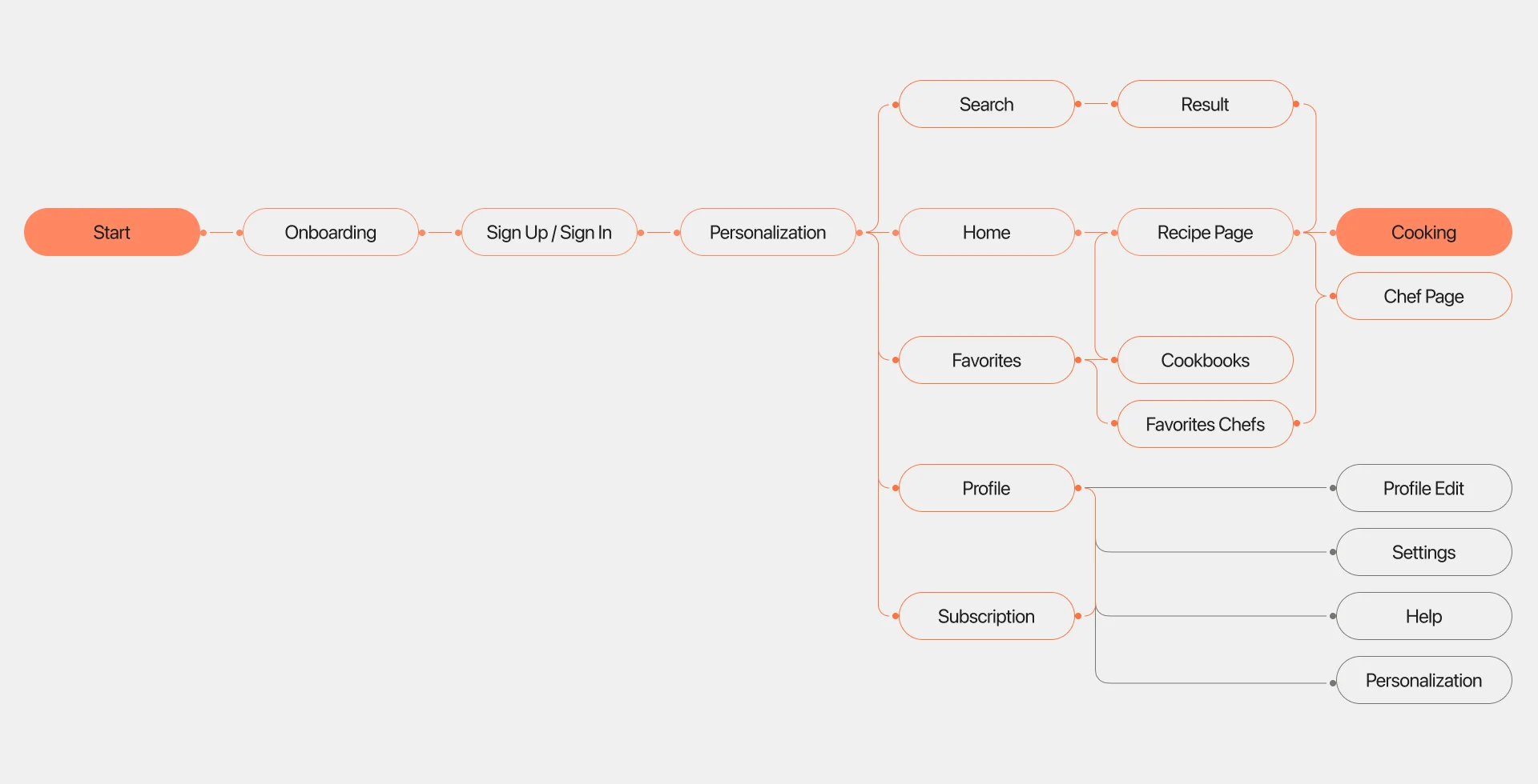
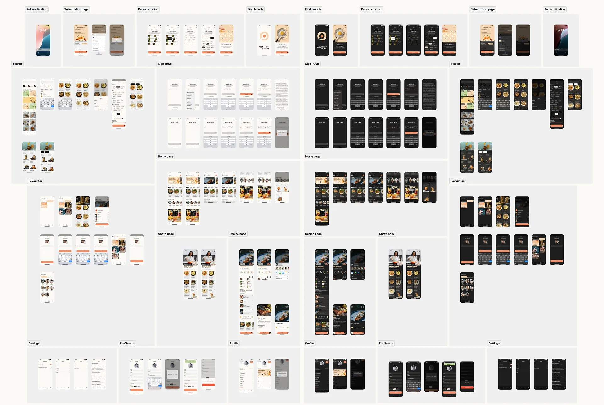
100+ wireframes were created during the design process, from the allergy picker and the paywall to the step-by-step cooking screens.
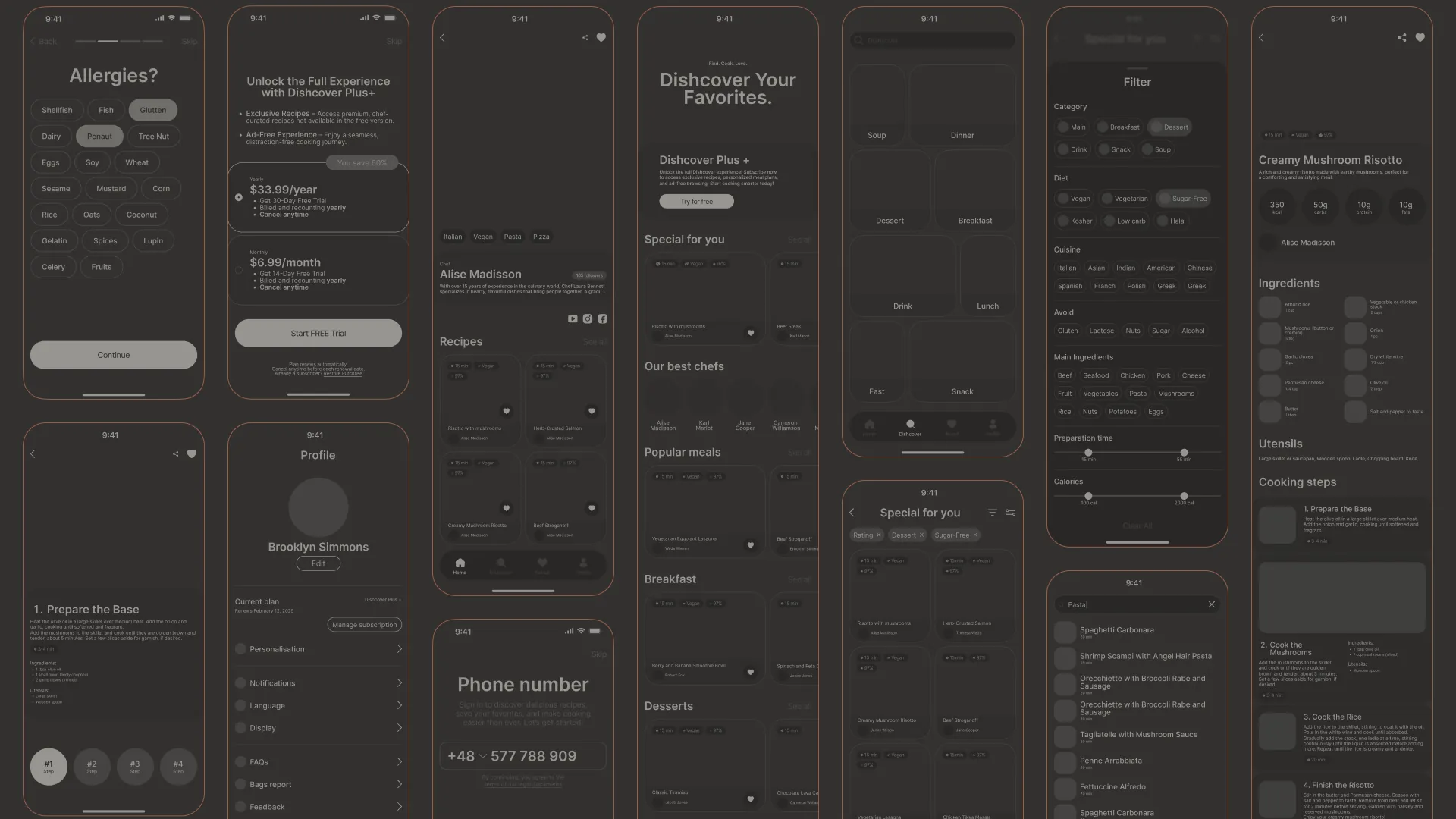
Every flow from the map, designed in light and dark mode from one set of components.
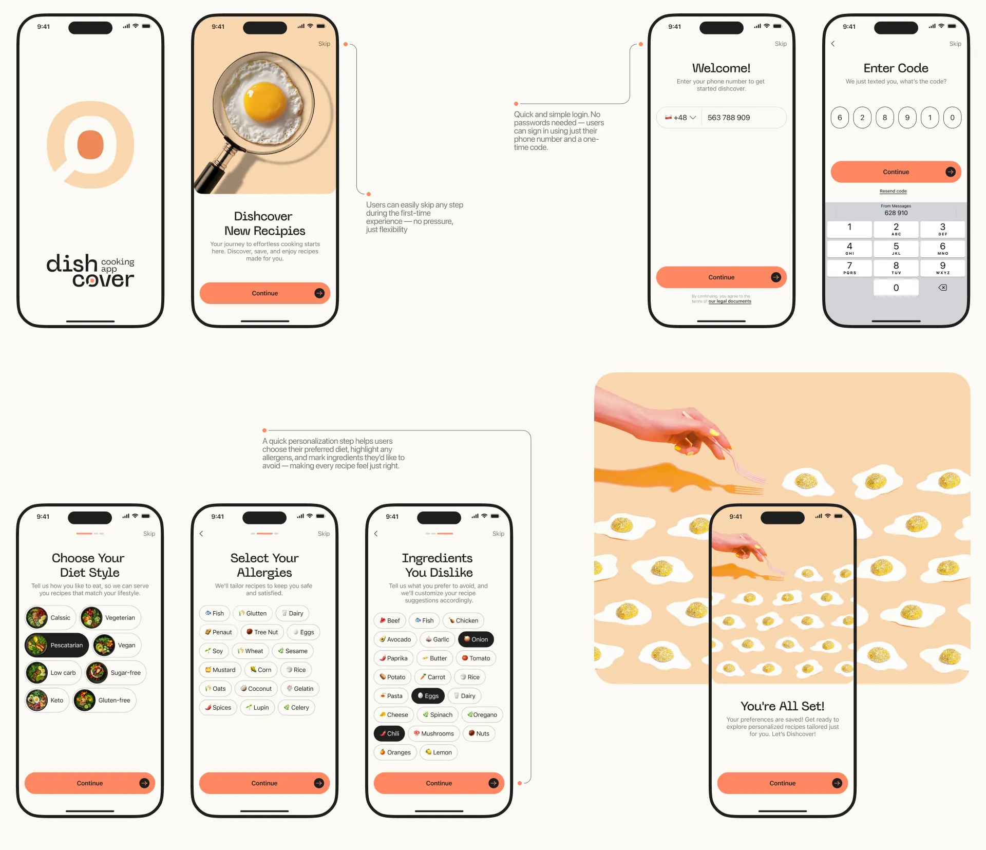
Screen 01
Users can skip any step during the first-time experience — no pressure, just flexibility. Login is quick and simple: no passwords, just a phone number and a one-time code. A short personalization step lets users choose their diet, highlight allergens and mark ingredients they'd like to avoid, making every recipe feel just right.
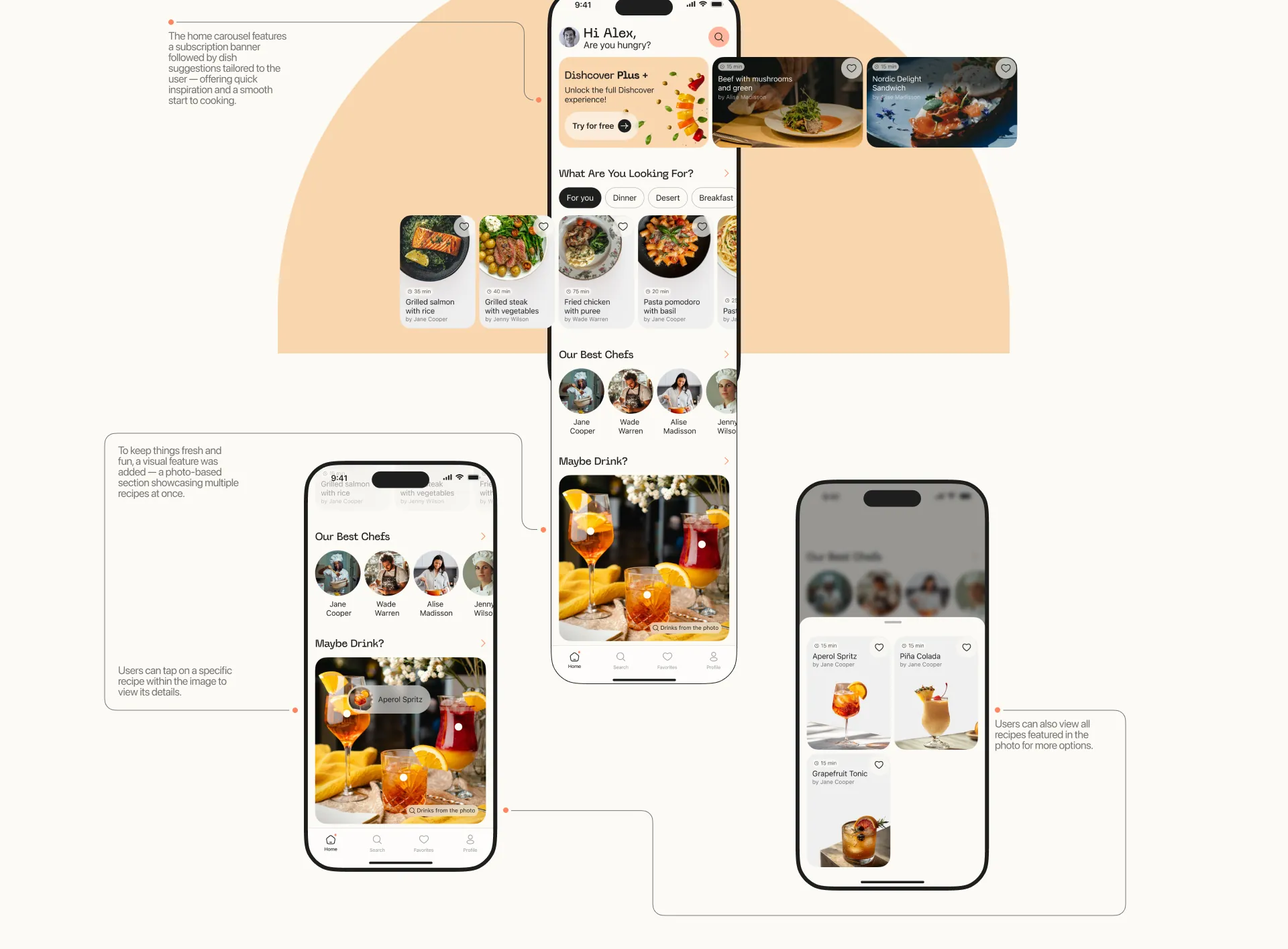
Screen 02
The home screen brings everything together — personalized recipe suggestions, easy access to filters, and a seamless way to jump back into cooking. The carousel opens with a subscription banner, followed by dishes tailored to the user. To keep things fresh, a photo shows several recipes at once: tap a dish in the picture to open it, or see every recipe in the photo as a list.
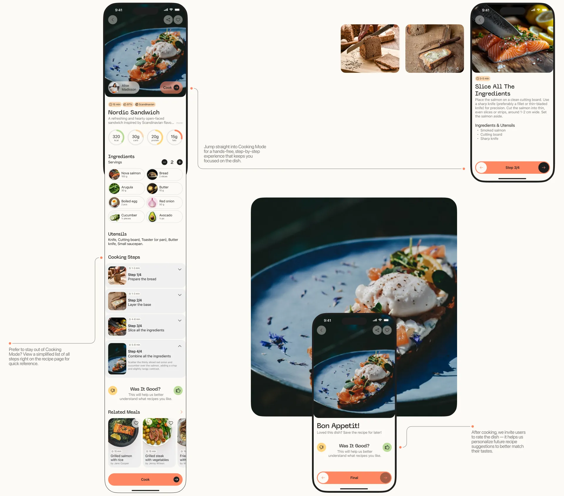
Screen 03
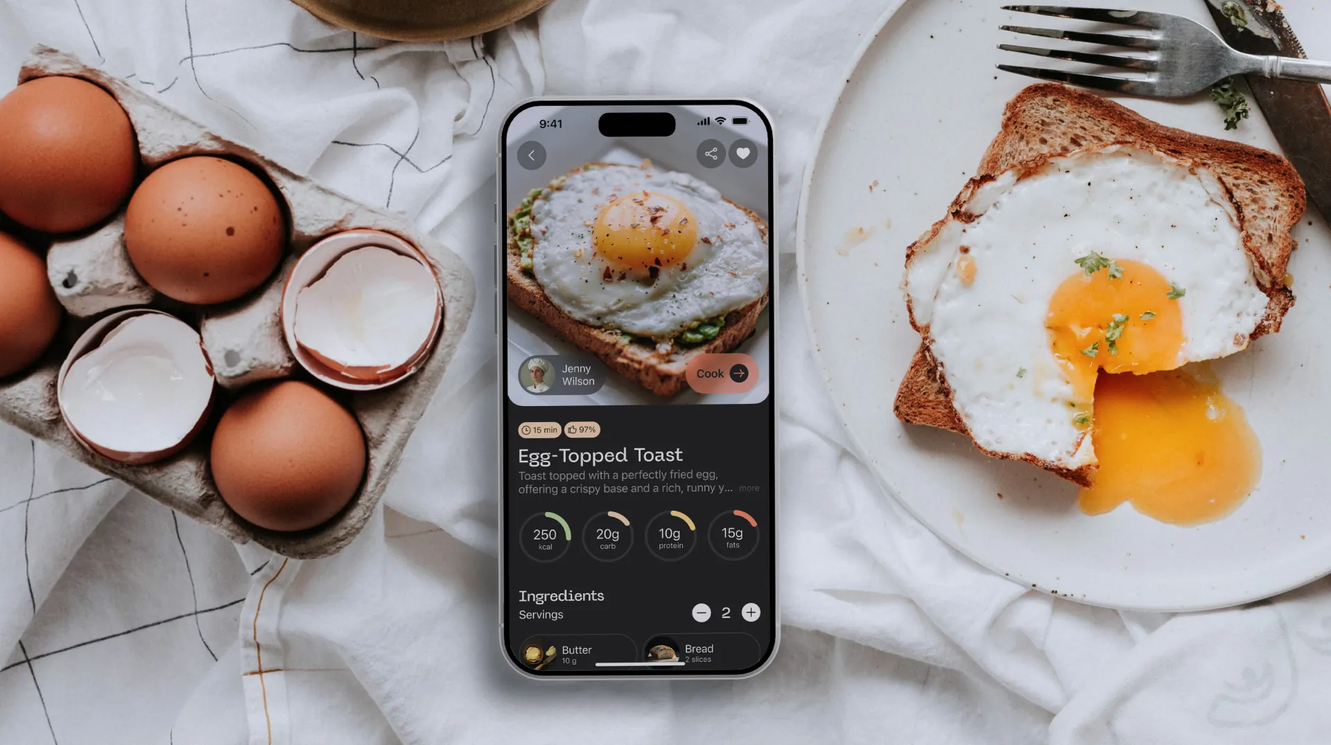
Everything you need to cook — in one place: step-by-step instructions, ingredients and tips. Cooking Mode is a hands-free, step-by-step experience that keeps you focused on the dish. If you'd rather stay out of it, the recipe page keeps a simplified list of all steps for quick reference. After cooking, a short rating helps personalize future suggestions.
Screen 04
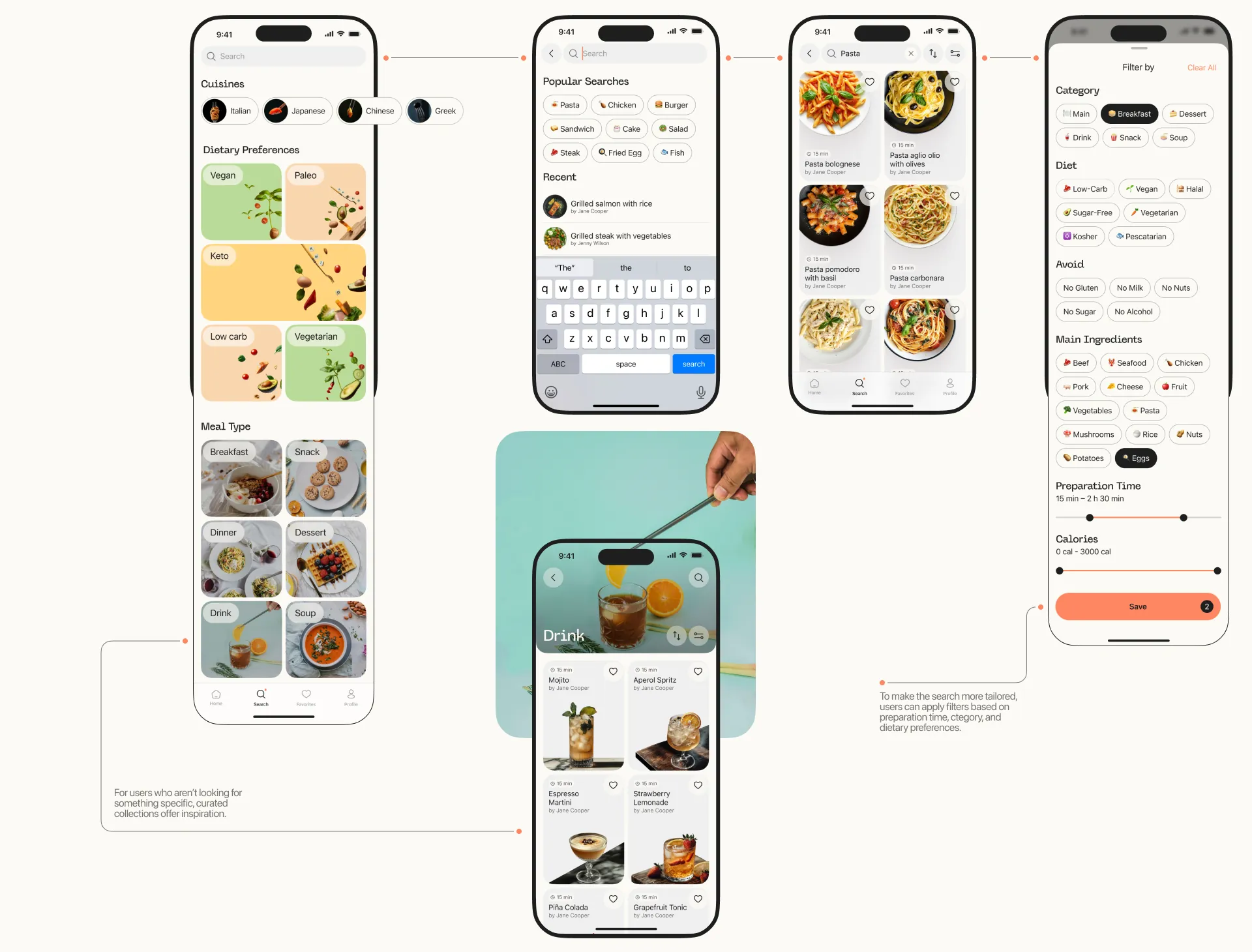
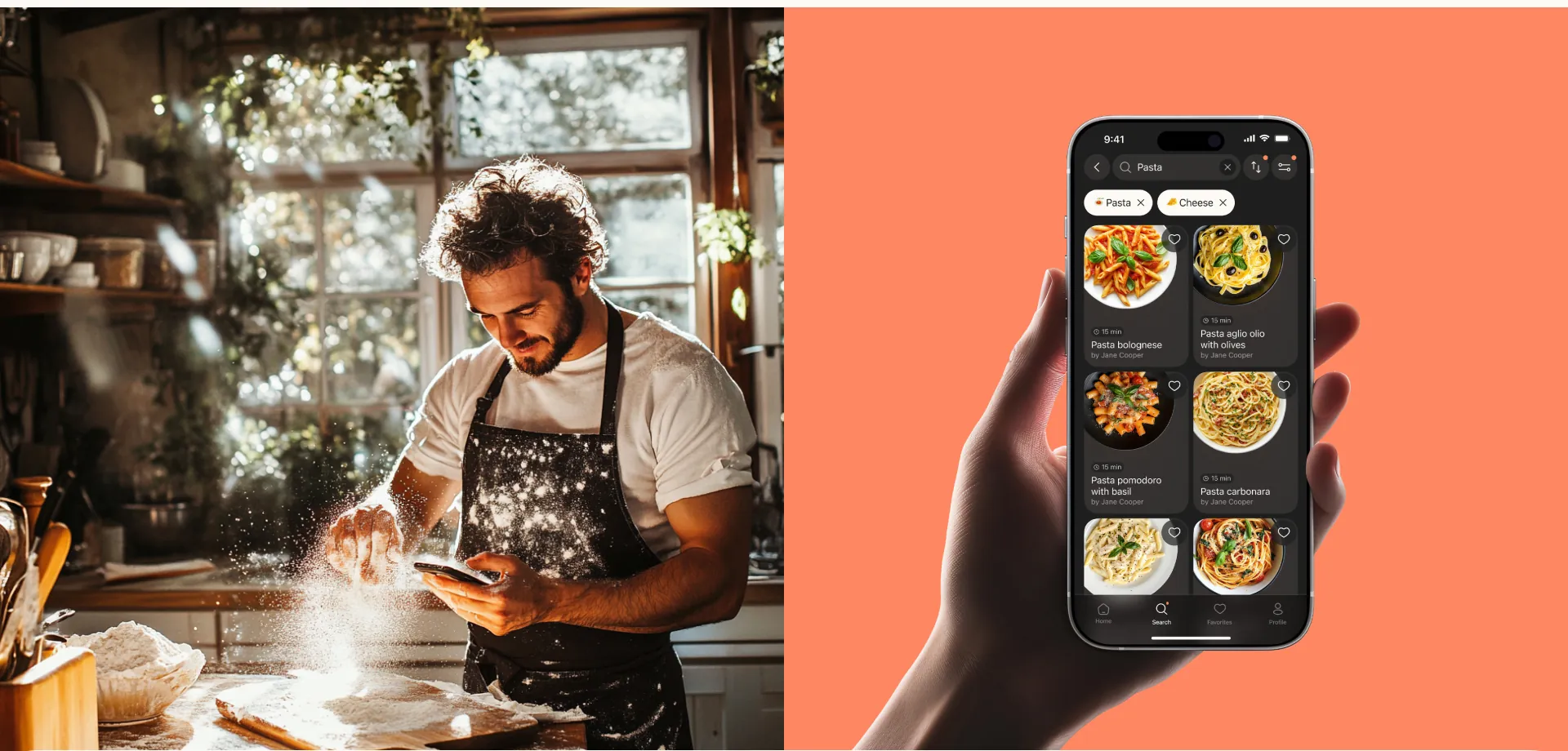
Search finds recipes by ingredients, dish names, or simply exploring ideas. For users who aren't looking for something specific, curated collections offer inspiration. To make the search more tailored, filters cover preparation time, category and dietary preferences.
Screen 05
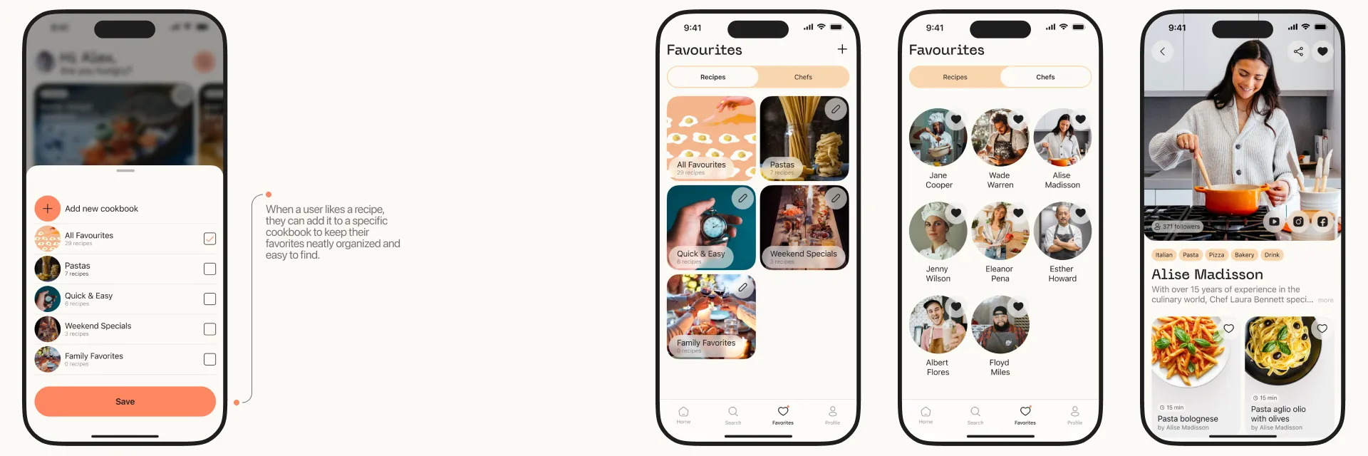
Your go-to place for saved content: the Favorites page lets you revisit both your favorite recipes and chefs. When a user likes a recipe, they can add it to a cookbook to keep their favorites neatly organized and easy to find.
Screen 06
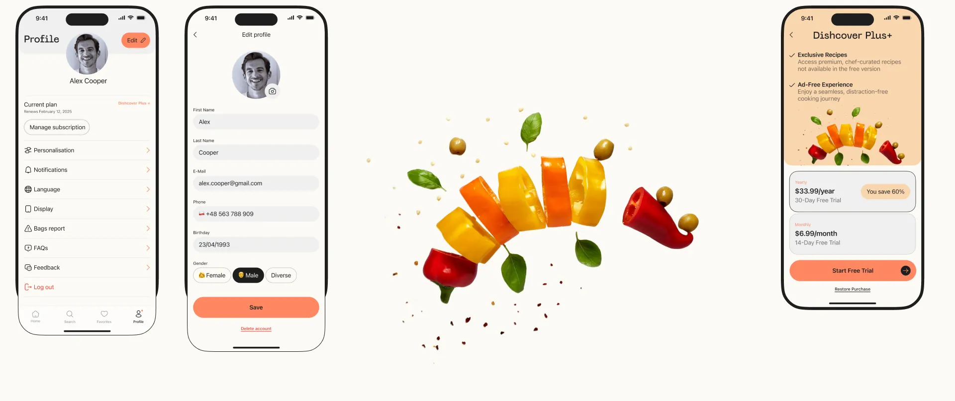
Dishcover relies on a subscription model as its primary way to support the app and provide premium features. Dishcover Plus+ adds exclusive recipes and an ad-free experience, yearly or monthly, each with a free trial. The profile keeps the current plan next to personalization, notifications, language and display settings.
100+
screens
every flow from the journey map
3.5
months
from research to the last screen
160+
hours of work
2
modes, light and dark
from one component set
Thanks for reading to the end. The original case, with the films in full, lives on Behance.
50K+
views on Behance
2.3K
appreciations on Behance
Bondata
An employee-engagement analytics platform for HR leads and managers
(view)
Evoke
Art direction for an AI companion that must not behave like one
(view)
Your Vet
In progress