← Home

Case study · Evoke

How Evoke v2 fixes the reasons people quit the first version.

Evoke is a Polish AI companion for difficult emotions: conversations, short exercises and a marketplace of psychologists. It earns on subscriptions and booked sessions, and for many people it is the step before therapy. The client came to us with a live MVP; I led the next iteration, v2, now in development.

My contribution
Discovery and research
UX and information architecture
Usability and desirability testing
Art direction and design system
Guidelines for development
Industry
Mental health
Platform
iOS and Android
Timeline
Jan – May 2026
Status
In development

Goal

Lift 30-day retention from 3.1% to 5% within three months of launch; the category median is 3.3%. Retention feeds both revenue streams: people subscribe and book only after weeks of use. No daily-use target on purpose: people open Evoke when something happens.

Tracked alongside it

  1. 01

    First messages: screens before the first message in the flows, the share who send one after launch

  2. 02

    Follow-ups: opened, and returns within two days, the early read on retention

  3. 03

    Upgrades: explaining the paid plan in testing, upgrades after launch

  4. 04

    Bookings: reaching the booking screen from a chat in testing, bookings after launch

  5. 05

    Usability: task success, SEQ and SUS on the MVP's five tasks

Results at a glance

v2 isn't live yet: the live MVP against the v2 prototype, same five tasks, 8 participants each. Screens are counted in the flows.

  • Screens before the first message:

    5to1

  • Explained correctly what the paid plan adds:

    3 of 8to7 of 8

  • Task success, reaching the booking screen from a chat:

    2 of 8to6 of 8

  • Task success, finding an exercise for how you feel:

    4 of 8to7 of 8

  • Average task ease, SEQ 1–7:

    4.1to5.8

  • SUS score:

    58to76 (+18 points)

Problem

Only 3.1% of MVP users still opened Evoke 30 days after install, and both revenue streams went with them: 0.8% upgraded, 0.4% booked a specialist. The MVP asked for an account before the first word, cut conversations at a message limit, graded people's emotions and hid specialists in a tab few opened.

Research

  • 10

    in-depth interviews

    with MVP users, 4 of whom had left

  • 8

    baseline test participants

    5 tasks on the MVP, and SUS

  • 4

    licensed psychologists

    from the marketplace, interviewed

Also

  1. 01

    Funnel analytics of the live MVP, from install to booked session

  2. 02

    Support emails and store reviews, tagged by theme

  3. 03

    Nobody in acute crisis recruited; a psychologist on call in every session

Key findings

  1. 01

    Interviewees who had thought about therapy but never went

    7 of 10

    “I’m not sure my problem is big enough.”

  2. 02

    People paid or booked only after three weeks

    The median upgrade came on day 19

  3. 03

    New users who left at sign-up, before a single message

    38%
  4. 04

    Free conversations that hit the message limit, often mid-thought

    17%

    Only 1 in 25 of those users upgraded

  5. 05

    People came before an event they dreaded, almost never after it

    And scores about themselves read as a grade: “I don’t want to be rated for how I feel”

  6. 06

    Users who ever opened the specialists tab

    6%

    The riskiest moment, psychologists said: a chatbot reply to someone in crisis

Source: MVP funnel analytics, support emails and store reviews, baseline usability test (n = 8), interviews with 10 users and 4 psychologists.

Ideation

  1. 01

    Design sprint with the founders and a clinical psychologist

  2. 02

    Journey map from first launch to first booked session, MVP vs v2

  3. 03

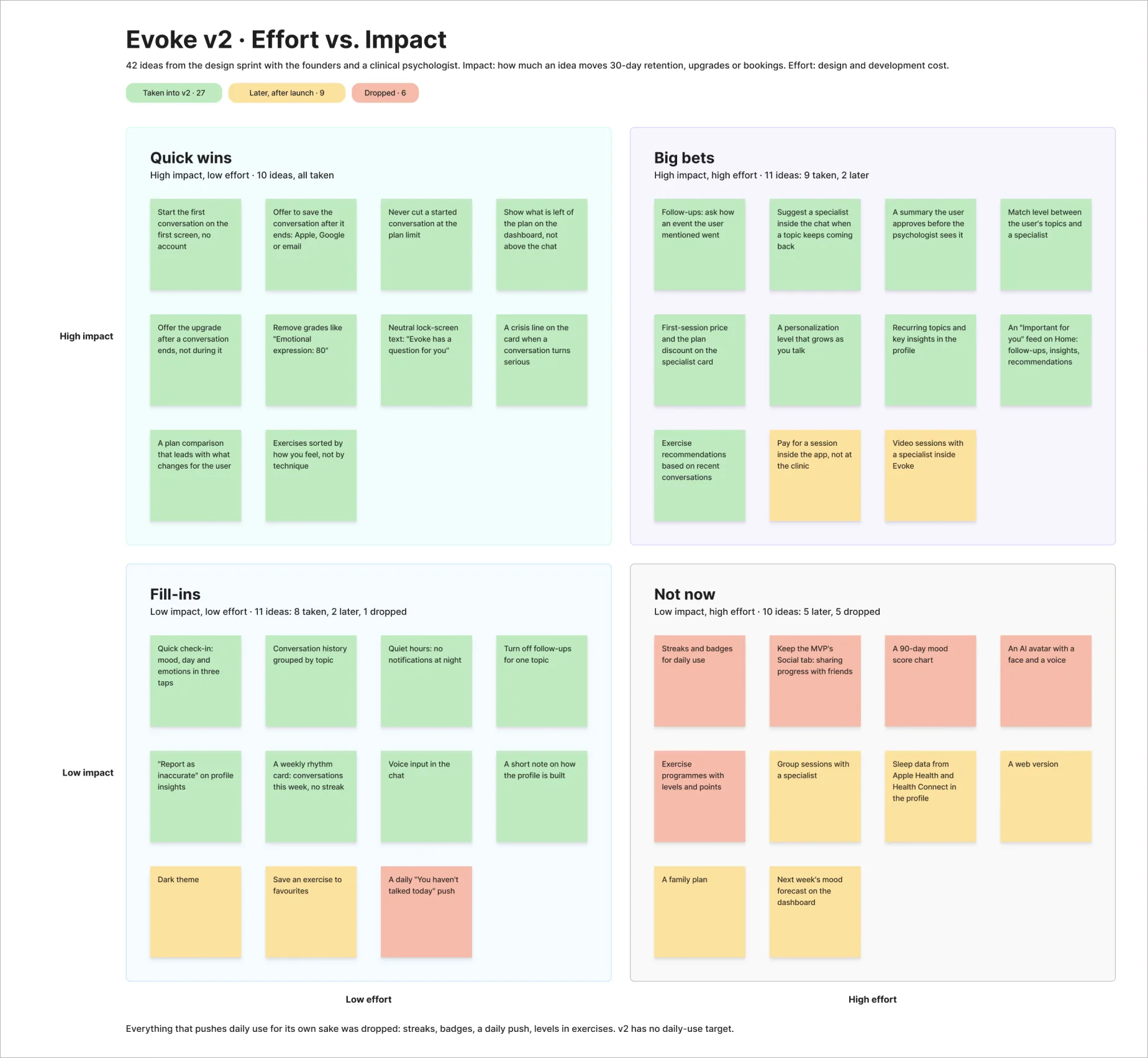
    Effort vs. Impact matrix for 40+ ideas

Effort vs. Impact matrix: 42 ideas from the design sprint sorted into quick wins, big bets, fill-ins and not now, coloured by taken into v2, later and dropped
Effort vs. Impact matrix: 42 ideas from the design sprint. Everything that pushes daily use for its own sake was dropped.

Key ideas we took forward

  1. 01

    Talk first, sign up later

  2. 02

    Evoke follows up after an event you mentioned: "How did the interview go?"

  3. 03

    Limits that never cut a conversation

  4. 04

    Exercises sorted by how you feel

  5. 05

    A way to a specialist from inside the chat

Prototyping

I tested the flows in Figma with 8 MVP users on the baseline's five tasks, with a psychologist on call.

Design

v2 kept the MVP's core: conversation, exercises, a growing profile and specialists. I reworked the five places where the funnel lost people and moved every screen onto a new design system: one typeface, blue and pink ramps and Material UI's 8px grid. A desirability test with 30 people chose between three directions: the MVP read as "impersonal" and "sterile", the winner as "calm" and "trustworthy". A second designer helped under my direction.

Decision 01

Evoke follows up on what you told it

MVP scores like "Emotional expression: 80" read as a report card and gave no reason to return. v2 keeps only numbers that describe, not grade, and when you mention an interview or a talk with your boss, Evoke asks afterwards how it went. The question comes right in the notification, "How did the talk with your boss go?", and follow-ups for any topic can be turned off in one tap.
Decision 02

From a conversation to a specialist

Most users aren't ready for a therapist's office; the chat is where they find out. When a topic keeps coming back, Evoke suggests a specialist in the chat, with prices one tap away, and the user approves the summary the psychologist sees. In a crisis the card leads with a crisis line. All four psychologists signed off on the flow.

Decision 03

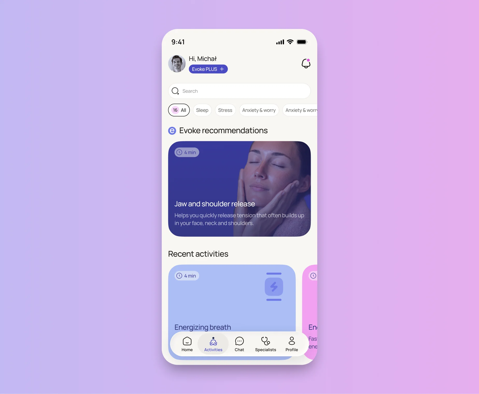
Activity library

For evenings when people don't want to talk. Exercises are sorted by how you feel, not by technique. Photos won for one recommended exercise but turned into noise in a list of 80, so the mixed version stayed. Recommendations are signed "Rekomendacje Evoke", so the app speaks in one voice.

The activity library: an Evoke recommendation on top, recent activities below

Decision 04

Limits that never cut a conversation

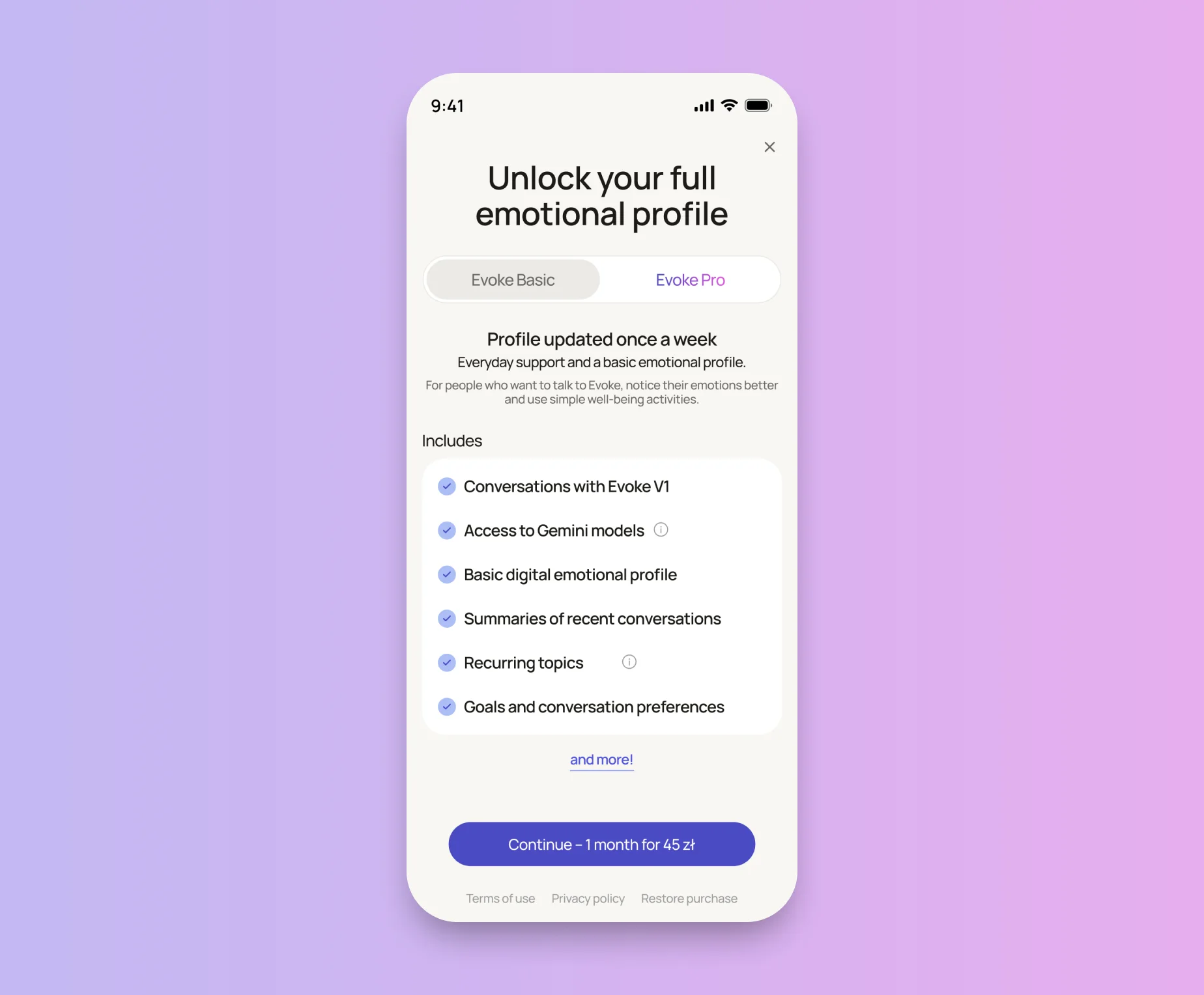
The MVP counted "4 of 200 messages" above the chat and cut people off mid-thought. v2 plans count conversations, and a started one can always be finished; the upgrade comes after it ends. 3 of 8 testers couldn't tell the plans apart, so the comparison now leads with what changes for you.

The plan screen: Evoke Basic and Evoke Pro, with what each one includes

Decision 05

Talk first, sign up later

The MVP asked for a login before the first word, and 38% left right there. In v2 one screen comes first: what Evoke is, that it isn't a crisis service, and consent to process what you share. Then the conversation starts, and saving it with Apple, Google or email comes after. In testing, a sign-up prompt after three messages felt like a paywall, so it moved to the end of the first conversation.

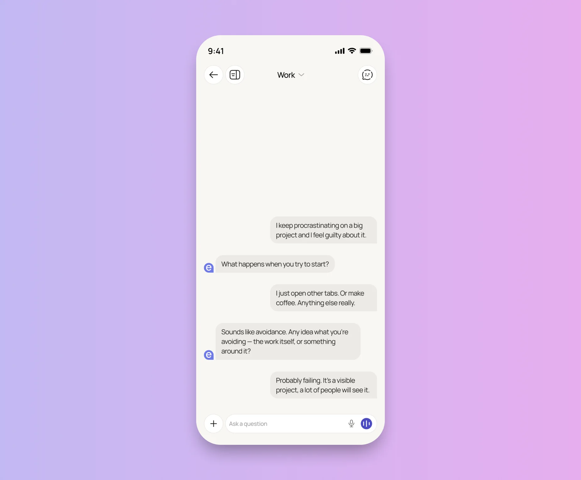
The v2 chat: a conversation about procrastination, started before any account

Handoff

Mockups, specs and a Material UI theme went to development with psychologist-reviewed scripts. v2 is being built now, and the site is collecting a waitlist.

Results

v2 isn't live yet: the live MVP against the v2 prototype, same five tasks, 8 participants each. Screens are counted in the flows.

  • Screens before the first message:

    5to1

  • Explained correctly what the paid plan adds:

    3 of 8to7 of 8

  • Task success, reaching the booking screen from a chat:

    2 of 8to6 of 8

  • Task success, finding an exercise for how you feel:

    4 of 8to7 of 8

  • Average task ease, SEQ 1–7:

    4.1to5.8

  • SUS score:

    58to76 (+18 points)

What we will measure at launch

v2 cohorts from the first three months against MVP cohorts of the same length.

  1. 01

    30-day retention: 3.1% → at least 5%, the primary goal

  2. 02

    First message sent: from 54%

  3. 03

    Follow-ups opened and returns within two days: new, no baseline yet

  4. 04

    Upgrades within 30 days: from 0.8%

  5. 05

    Specialist bookings: from 0.4%

  6. 06

    Conversations cut by the limit: from 17% to none

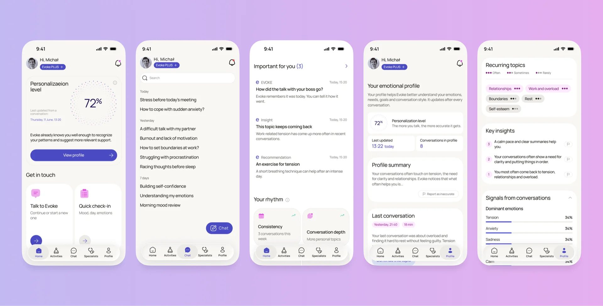
Five v2 screens: home with the personalization level, conversation history, the Important for you feed and the emotional profile

[ Other works ]

  1. 01

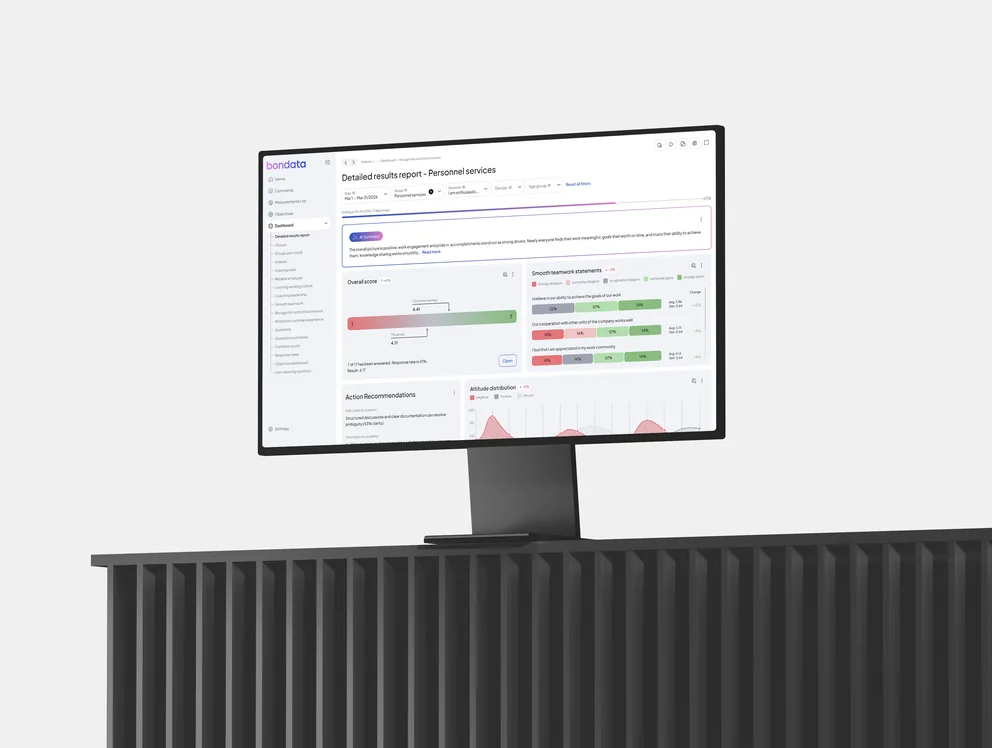
    Bondata

    Redesigning an HR analytics app to boost manager engagement

    • Web app
    • Redesign
    • HR analytics

    An employee-engagement analytics platform for HR leads and managers

    (view)

  2. 03

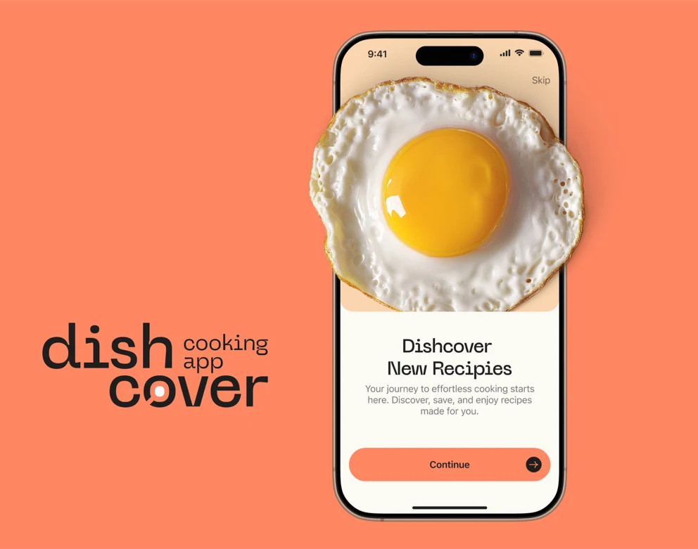
    Dishcover

    Designing a recipe app to make home cooking feel less like work

    • Mobile app
    • In development

    A culinary app with easy, step-by-step recipes for every taste

    (view)

  3. 04

    Your Vet

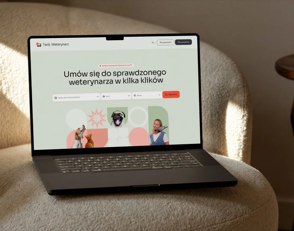
    Designing a vet marketplace to book a trusted vet in a few clicks

    • Web platform
    • Marketplace

    In progress